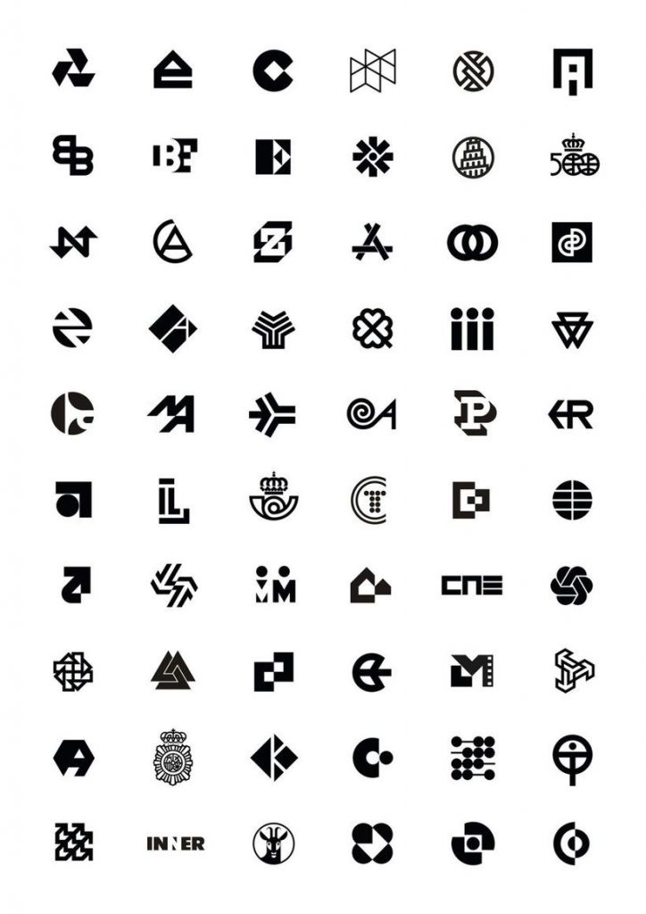
There is a person whose work has been present in Spaniards’ day-to-day, in spite of being something which goes unnoticed for the great majority of the population. In this article we are going to talk about one of the most influential and prolific graphic designers in Spain and, paradoxically, one of the lesser-known ones at the same time: José María Cruz Novillo, the man who changed the image of Spain.
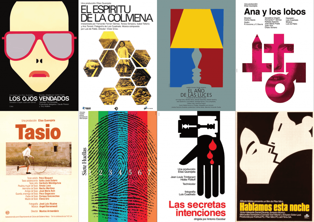
Born in 1936 in the city of Cuenca, José María Cruz Novillo is a self-taught graphic designer, drawer and sculptor. In 1958, he started his professional career as a drawer at an advertisement agency in Madrid, and it wasn’t until 1965 that he finally decided to set up his own graphic design studio. Since then, he designed corporate logos for multiple public institutions and businesses, some of them still currently in use, like the one of ‘El Mundo’, ‘Correos’, ‘Policía Nacional’, ‘Cadena Cope’, and even the flag of the Community of Madrid. Moreover, apart from designing such recognizable logos, he also has designed sculptures and posters for different movies.
Graphic design in Spain was practically non-existent in the 1960s: for example, the logo of the postal service ‘Correos’ was composed only by the naming and the coat of arms of the country, and the same thing happened with the national tobacco company. So, the relevance and the incidence of Cruz Novillo in the modernization process of the visual image of Spain is undeniable. Nonetheless, despite the huge influence his work had, very few people are conscious of who the author behind the creations really is.
Cruz Novillo, who described himself as a conceptual artist, considers that his style is distant from any trend or movement like constructivism and rationalism, but rather it is closer to minimalism. Furthermore, he claims that his artistic vision is more related to the ones of remarkable artists such as Marcel Duchamp and Kazimir Malevich (the Russian artist better known for the use of squares on his work). On the other hand, the basis of his artistic work –which makes his designs something unique– is basically composed by two geometrical figures: squares and circles. In addition, he also makes reference to the constant search for balance between ‘the maximum formal simplicity and the maximum conceptual complexity’, in other words, creating something with a deep idea in the least complex way possible.
To conclude, we would like to share one of his most recurrent reflections: ‘The designer is an archer who shoots arrows with the purpose of hitting the target. The artist, however, shoots the arrow and then proceeds to paint the target wherever the arrow landed’.