Early in 2020, we were invited to participate in a contest that consisted of creating a new logo for an Instagram account. The account, called Creactívate, was fundamentally focused on giving tips related to art and creativity. Unfortunately, in the end, our proposal wasn’t selected as a winner.
However, despite all the sadness and depression we have suffered through the last months, we have decided to showcase all of our designs in this post. So here you go!
Logo
For Creactívate’s logo, we decided to use the font Earworm Regular due to the feeling of softness its rounded closures reflect. Moreover, considering the nature of the account, the font was truly convenient as it could be considered both formal and casual, providing the brand with a professional aspect. In addition, we chose black as the main corporate colour of the logo.

Isotype
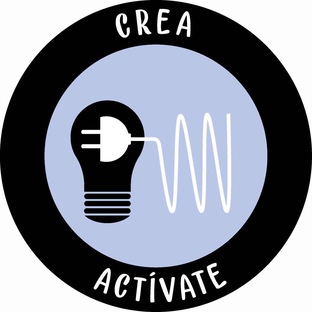
Considering that Creactívate only performed on Instagram, we decided to design an isotype with a circular shape, in order for it to fit perfectly with Instagram’s profile picture dimensions. Plus, we added a black outline in the border of the circle so that the body could be clearly appreciated, especially when displayed on a white background.
In this case, we introduced two characteristic elements: a light bulb and a plug (the first appears in black while the second appears in white in order for them to contrast easily). The light bulb (crea), had the objective of representing creativity, ingenuity, imagination, which are ideas that arise at times when one’s uninspired, the famous ‘Eureka‘ of Archimedes. On the other hand, the plug (actívate), is the representation of moving into action, of not being quiet, of being proactive, of not wasting time while watching life go by.
As Creactívate is the conjunction of creativity and activity, the head of the plug is placed inside the light bulb to transmit the idea that creativity is possible thanks to activity, and that creativity helps you to be active. As the famous quote commonly attributed to Pablo Picasso claims: Inspiration exists, but it has to find you working.
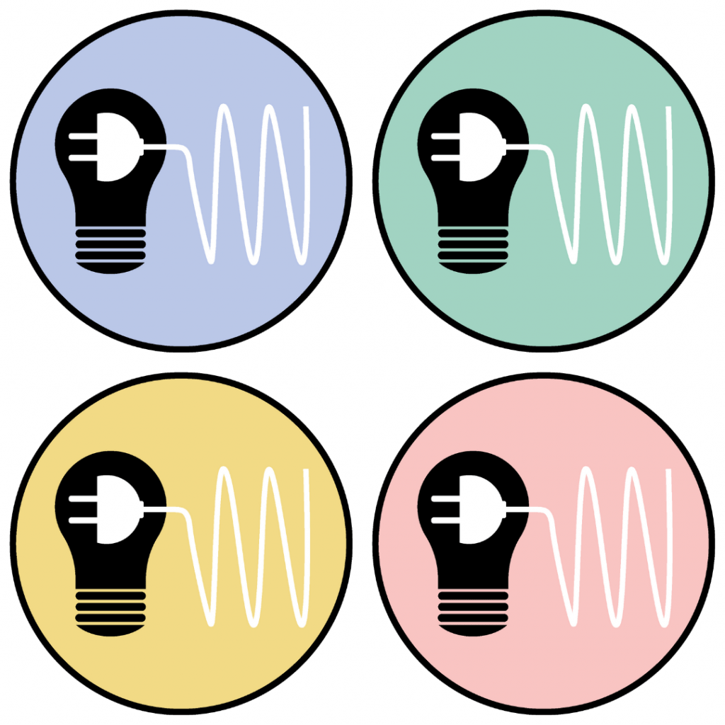
The main colour for the inner part of the circle was blue (#BAC8E8). However, as a secondary one we chose some pastel colours, to be precise the following ones: green (#A1D3C2), yellow (#F3D985) and pink (#F8C4C3).
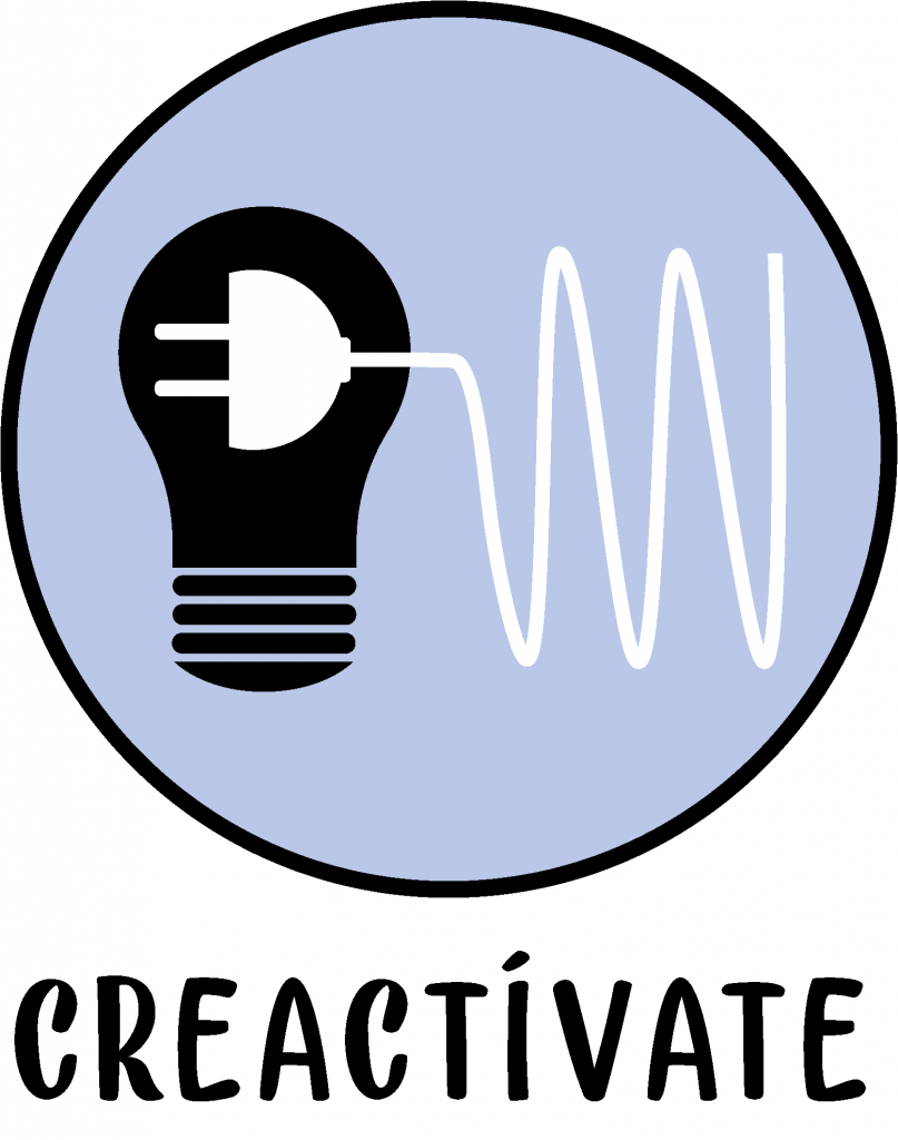
Imagotype
For the imagotype, we just combined the logo with the isotype by placing the first below the second.
Isologo
Finally, for the isologo, we increased the thickness of the outline in order to add the naming on it. However, in order to avoid the visual disproportion that would have resulted from adding the naming at the top (thus leaving the bottom empty), we have separated the naming into the two words that represent Creactívate: crea (create) and actívate (get active).